As Registrations has grown, we've ended up with some clutter, and details that should be easy to see have been tucked away. Today, we shipped a significant visual refresh to help you focus on the task at hand.
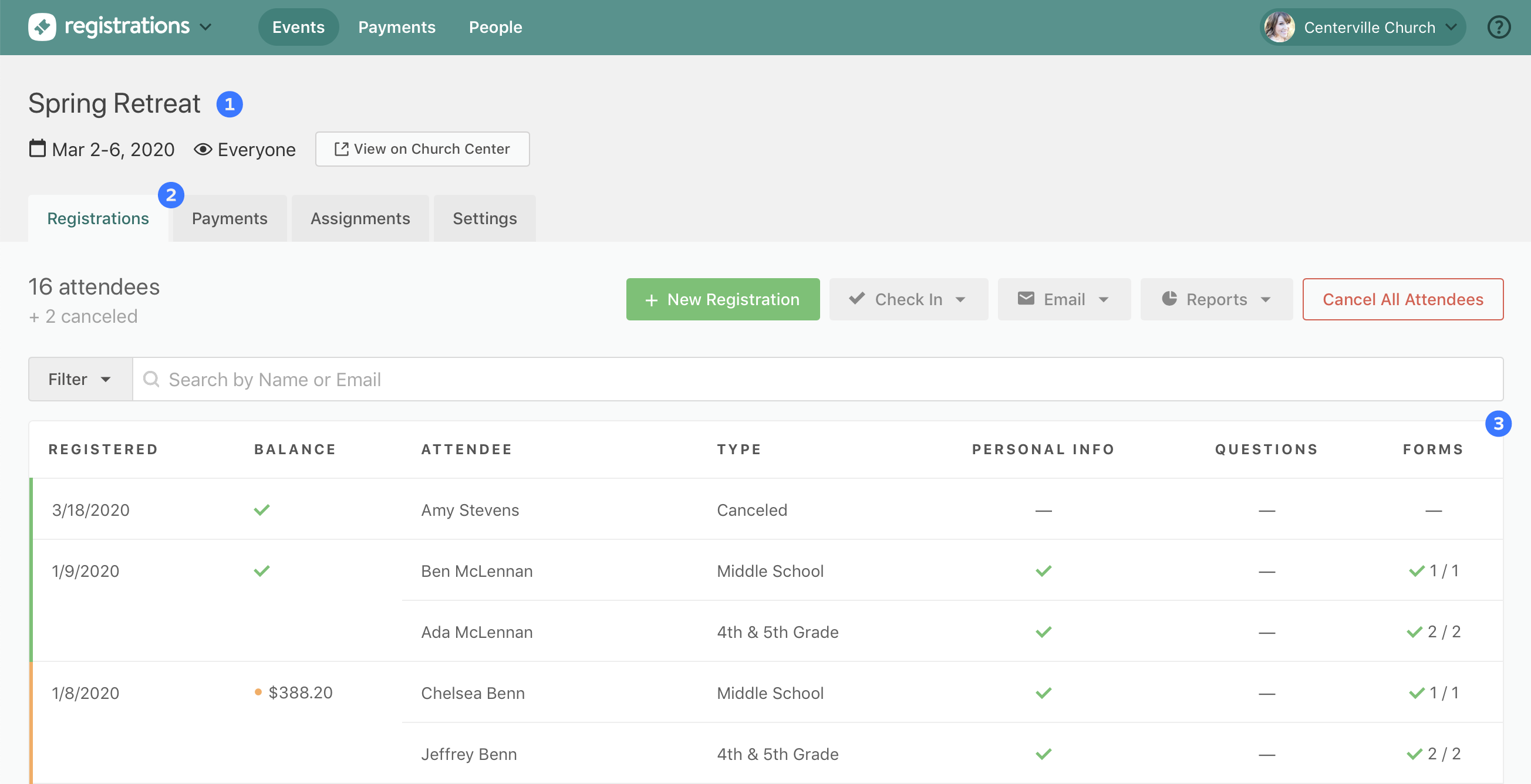
1 — At the top of the page, you can now see the event dates and visibility at a glance.
2 — Quickly jump between the four primary sections of an event — registrations, payments, assignments, and settings — from tabs along the top.
3 — There's now more horizontal space when viewing the registrations and payments lists. Even on smaller screens, you should now be able to see all the information without needing to scroll to the right.
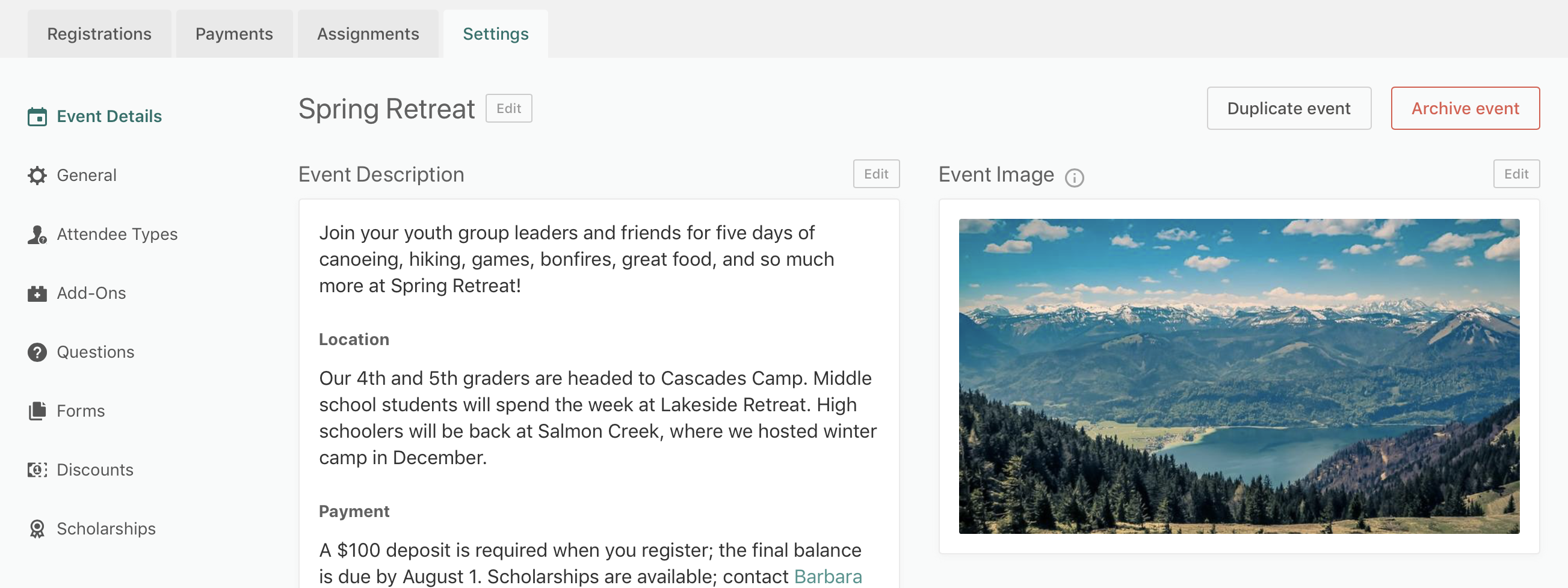
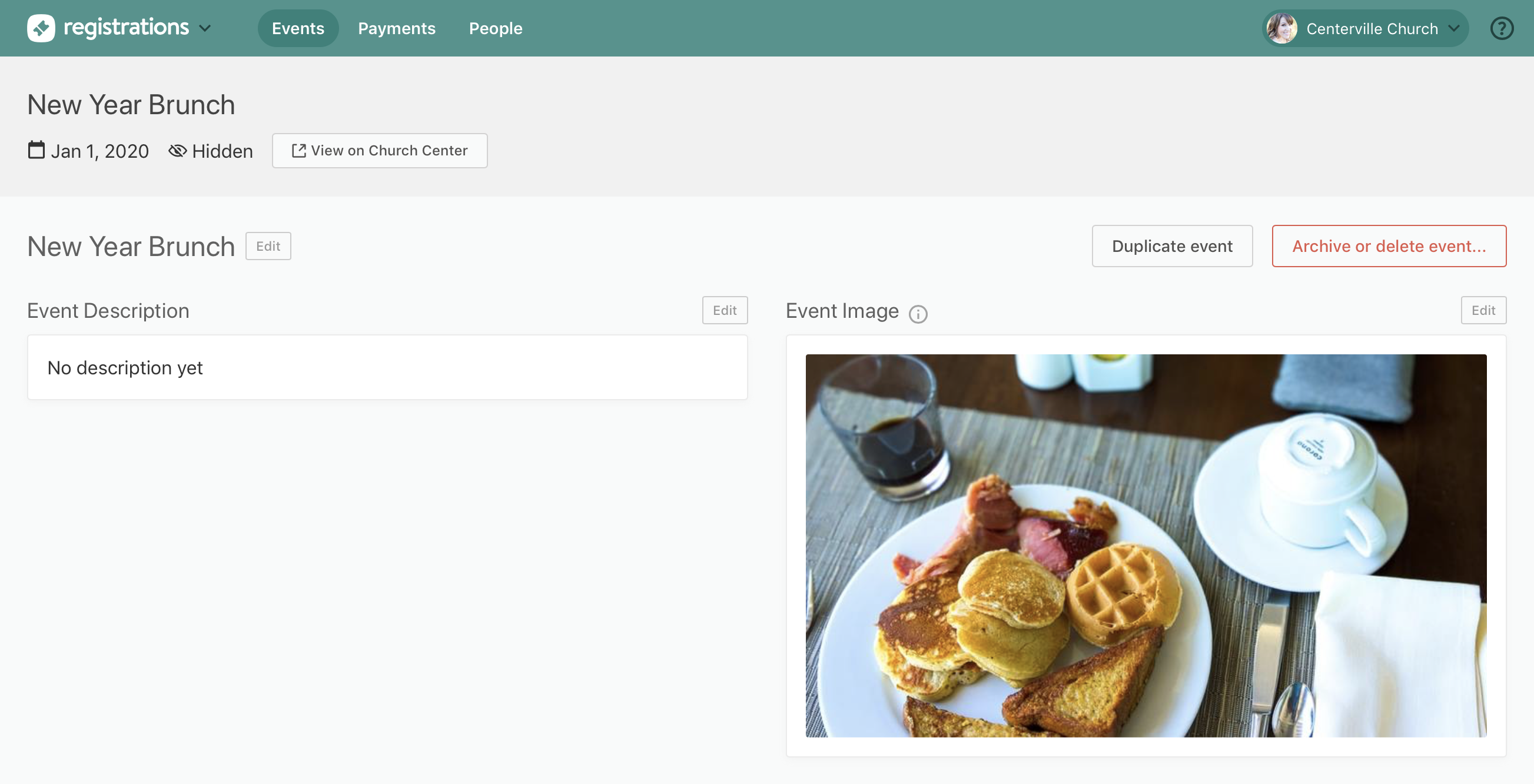
Within settings, we've tidied things up a bit so that the event settings — such as image and description — are clearly separate from the signup settings — such as whether signups are open or closed, or whether guest registrations are enabled.
These updates are especially helpful for announcement-only events, where you're focused exclusively on the event settings and don't need signup settings at all!