Today we're launching a visual refresh to Planning Center—a simplified, unified look across all products! This new expression of our signature colors offers a modern, forward-facing look that gives our customers a more consistent experience of the entire system.
For years, our bold, colorful headers were a design signature that set us apart from other church software companies as fun and creative, and that history was hard to let go of.
But the look and feel of our new design reflects the innovation Planning Center is known for, without losing the whimsy or the functionality of the product you rely on.
We are releasing the design in open beta. You can enable it for your personal account from your profile and switch back to the previous design anytime during the beta.
What changed: New gradients, navigation, and styling
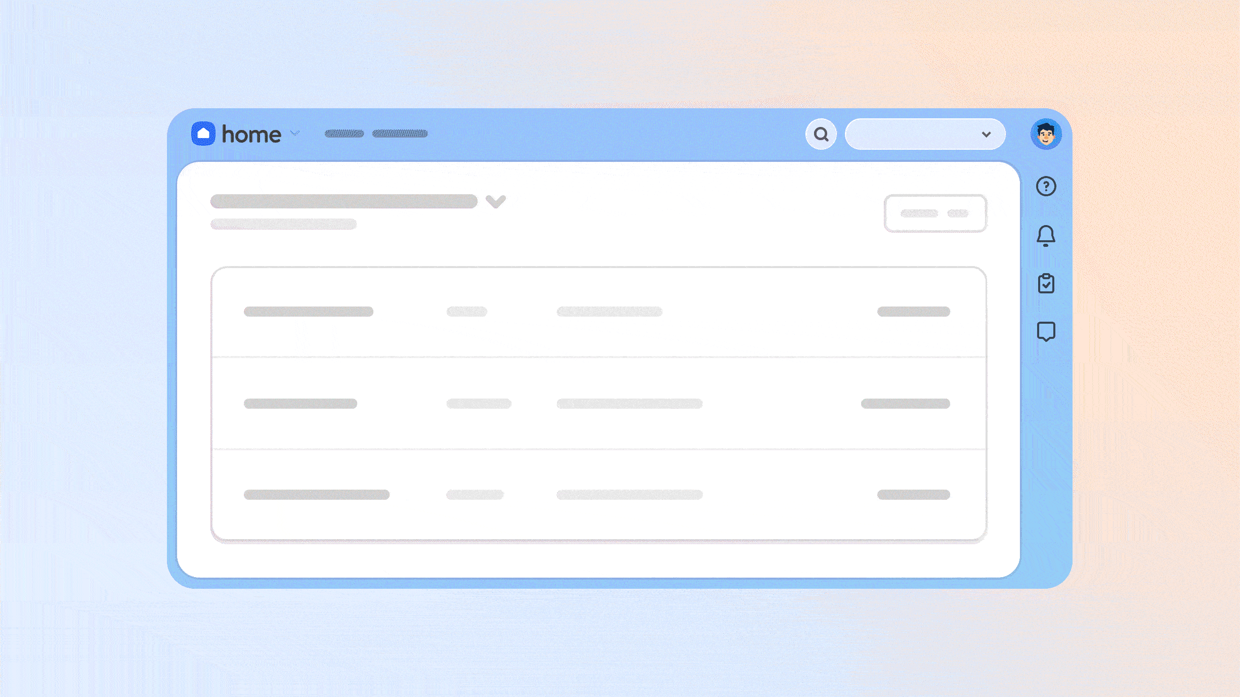
We designed the new Planning Center aesthetic to create a calmer, smoother workflow, without forcing you to relearn anything. All the tools you rely on day-to-day are in the same place and work the same way they did before this refresh.
With a gentler color palette, standardized navigation, button patterns, and a simple layout, you can confidently navigate your ministry work knowing exactly where you are and what's next.
Soft gradient backgrounds for the top bar and tool bar that transition from each product's signature color into Planning Center blue—honoring individual product identity while creating visual unity.

Clearer navigation and smoother flow across all product headers and sidebars—moving you through your tasks with a predictable visual flow and orienting you within Planning Center.


Buttons that speak the same language. The following picture is only a sampling of how we consolidated our previous design's many kinds of button patterns and styling.

Beyond those core unification improvements, we added a myriad of finishing touches you may never notice—but will make everything nicer to use, including:
Subtle fade-in animations for drawers/modals
Consistent sidebar navigation
Simplified tab design for the top navigation and side navigation
Improved layouts that adjust to any screen size (on both your phone and computer)
Updated accessibility compliance
What’s exciting is how these updates lay the foundation for the future of product design and growth.
The journey to redesign: “Project Phoenix"
This project started with a simple recognition: While we've always said Planning Center products work better together, they didn’t always look like they belonged together.
Our design team faced what felt like "an immovable object"—9 products with completely different looks, ways of communicating, and the same or similar calls to action built in different ways.
The breakthrough came when Shane Armitage, our Director of Product Design of 15 years, presented a vision that maintained each product's unique personality while creating visual unity with a modern, beautiful, and useful design.
Internally, we named it “Project Phoenix” to signify the significant change of starting with a fresh burst of color.
So what's next?
Building for an adaptable design future
This project is a major leap forward in our design team’s ability to unify, change, and update the look and feel of Planning Center in the same way across products.
Because our products now share a design foundation, our team can more easily build new features that span across the system—like a streamlined event workflow or consistent people page views.
This unlocks endless possibilities for system-wide improvements, more intuitive design and faster updates we couldn’t have built before.
Curious minds will have to wait and see. 🤫
Try it out and tell us what you think
The new design is in open beta and available for you to try! It’s a personal setting from your profile just for your account, and during the beta phase, you can always switch back to the old design.
So try it out, use Planning Center as you normally would, and let us know: How does it feel? Is anything confusing or hard to find? Anything unexpected? Your feedback helps us make it better.

Project Phoenix represents our ongoing commitment to refining the unity of our system and delivering a more cohesive experience. We’re really excited to finally share it with you.
Keep an eye out for more about this new design and what’s next!
💙 Planning Center