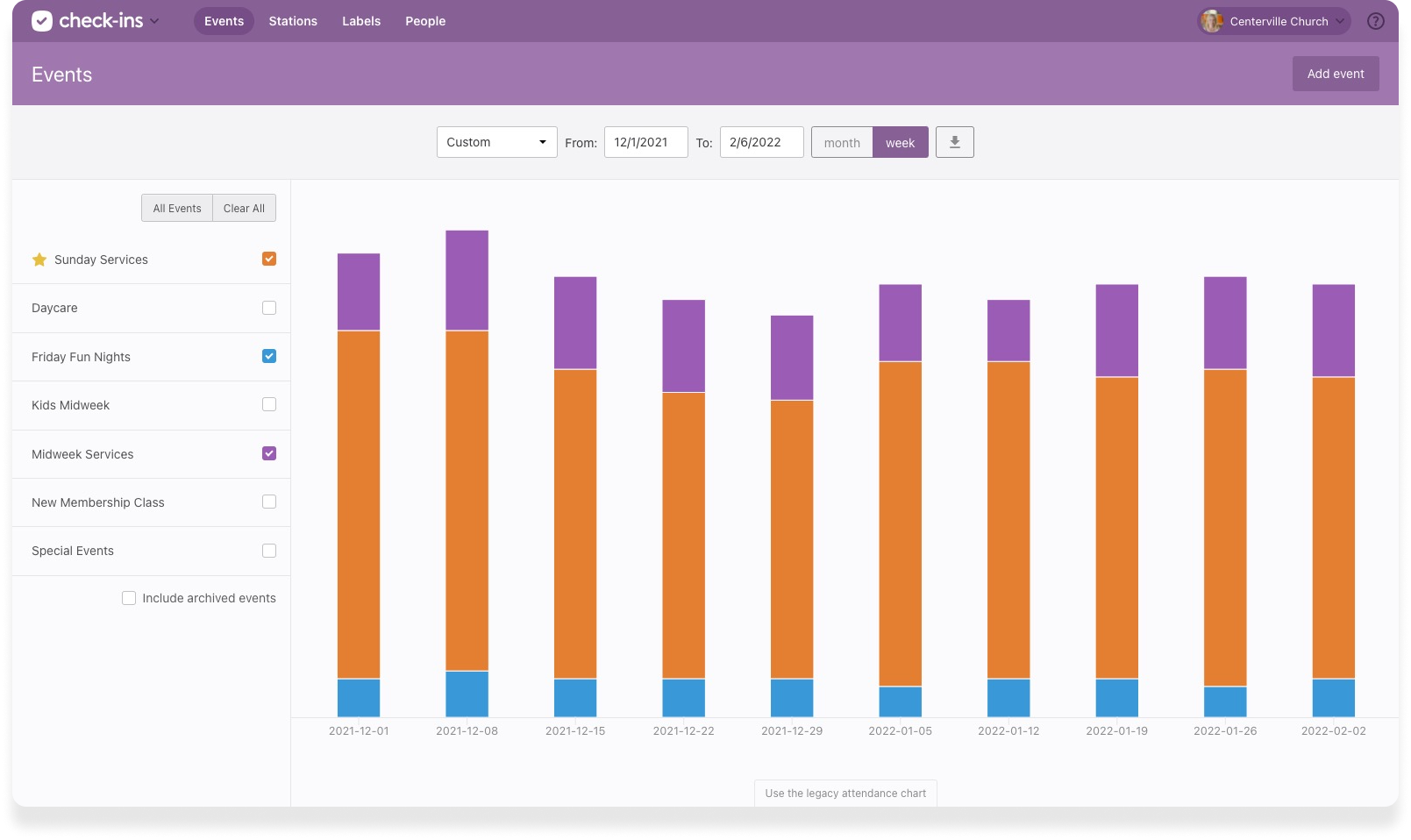
The first thing you see when you open Check-Ins is the chart showing all your events.
This chart represents your most popular events, compares week to week details, shows locations where you need more volunteers, and where attendance is slipping.
As of this week, we’ve completely upgraded the layout of the event chart to make it more customizable—so you can see the events and the event details you care about!

There are several new things here, including the ability to filter the chart by specific events, prioritize events you care about, and even drill into more detailed information about events, like location or time.
Here are a few of the highlights.
Event Attendance: Just the Way You Want to See It
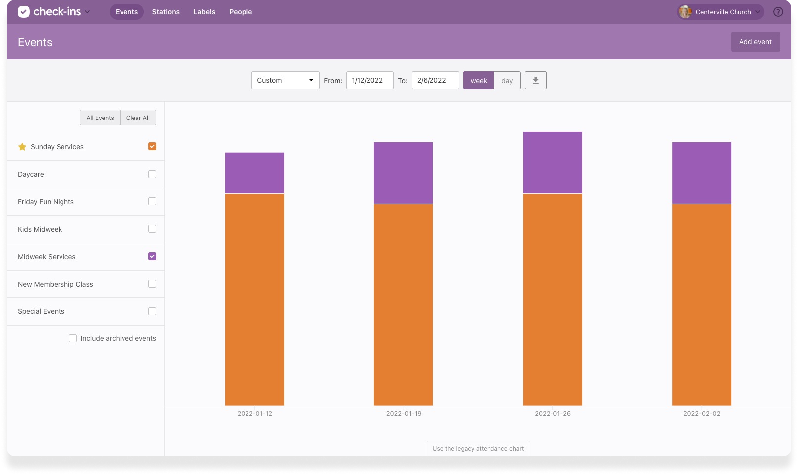
Get started by selecting which event(s) you want to see come to life on the chart. For example, maybe you only care to see attendance Midweek and Sunday Services, but not Youth Events. You can set it and leave it—we’ll save your settings every time you come back.

If your organization has a ton of events, favorite the ones you care about and they’ll always show at the top.
Get Into Event Details
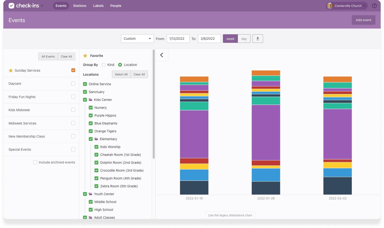
When you select a single event, the new Options button helps you narrow down the information on the graph.

From here you can choose to highlight certain folders, locations, times, or headcounts on the graph. You can also change the grouping of events from Kind (regulars, guests, & volunteers) to Location for a new way to see how popular each location is.
More to Discover
Customize your date range, print reports of specific views, and switch between options so much faster.
This is a completely new approach to the event chart, so we’d love to hear your feedback. If there’s a specific flow that you were used to, you can go back to the old view at the bottom of the chart, but we’d love to hear about it so we can keep improving.
We can’t wait to hear how you’re using it!
Happy checking in!
Team Check-Ins
:quality(80))