If you’ve been using Services since the beginning, learning one thing at a time and becoming an expert has been a snap. If you’ve just started using it 14 years in, then um...maybe not so much — there’s a lot there!
But how do you redesign a page that started your company and that millions are not only familiar with but have come to rely on heavily? Well, you do it slowly and carefully, with just a li—ttle bit of fear. 😬
We started with the following goals to make the page:
Familiar, inspired by the mobile app, other pages, and the old version
Clean and modern, fitting in with the rest of our products
Streamlined, showing the important things, hiding the rest in menus
Efficient, adding shortcut keys for options that are now in menus
Personal, highlighting different things for each user
Expandable, leaving room for future features
So let’s take a look at how we tried to accomplish those goals by taking a quick tour!
🍕 Personal Plan Pizza Page
Sorry, is anyone else working through lunch? Just me? Okay, well just like your favorite single-serving savory pie, the new plan page is both tasty and personal.
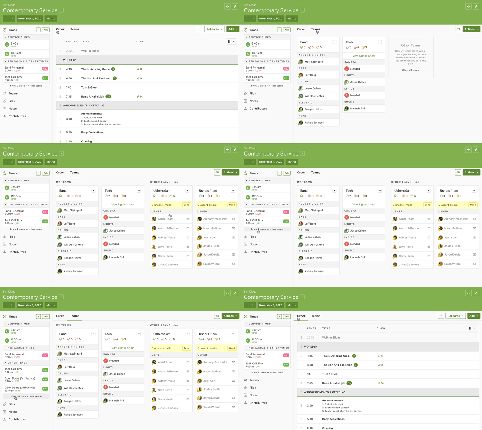
Some people need the details of everything happening in the service order, but many don’t and would rather focus on teams. The new tabs for Order and Teams let you view what’s important to you.

The new page also eliminates clutter by only showing you teams and times you’re involved with. Other teams and times are hidden away until you click to see them. Plus times now show the day of the week!
When it comes to the title of each plan, some churches just care about the name of the service itself, some add a custom title, and others group their sermons into series maybe with artwork. Whatever combo floats your boat, the header section is the G.O.A.T.

We also let you customize your view—collapse the entire sidebar, turn columns of the Order on or off, condense the whole table, or expand the page to fill a widescreen monitor. That’s hard to imagine, so here’s a video!

🤺 Action Packed
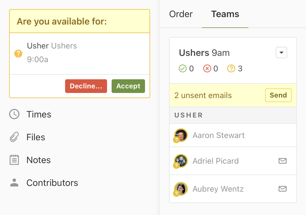
The new page calls attention to important actions needed from both schedulers and team members. First, we're helping you get your team to do something we know you’re begging them to do—respond to requests! Unconfirmed requests will remain persistently prominent until people click accept or decline.

When you are working on scheduling someone to a plan, an email notification is prepared, but until it’s sent, team members won’t see the plan in their schedule. The new page also puts a yellow banner at the top of each team with unsent emails to make sure you don’t forget.
🔥 Hot Ticket Items
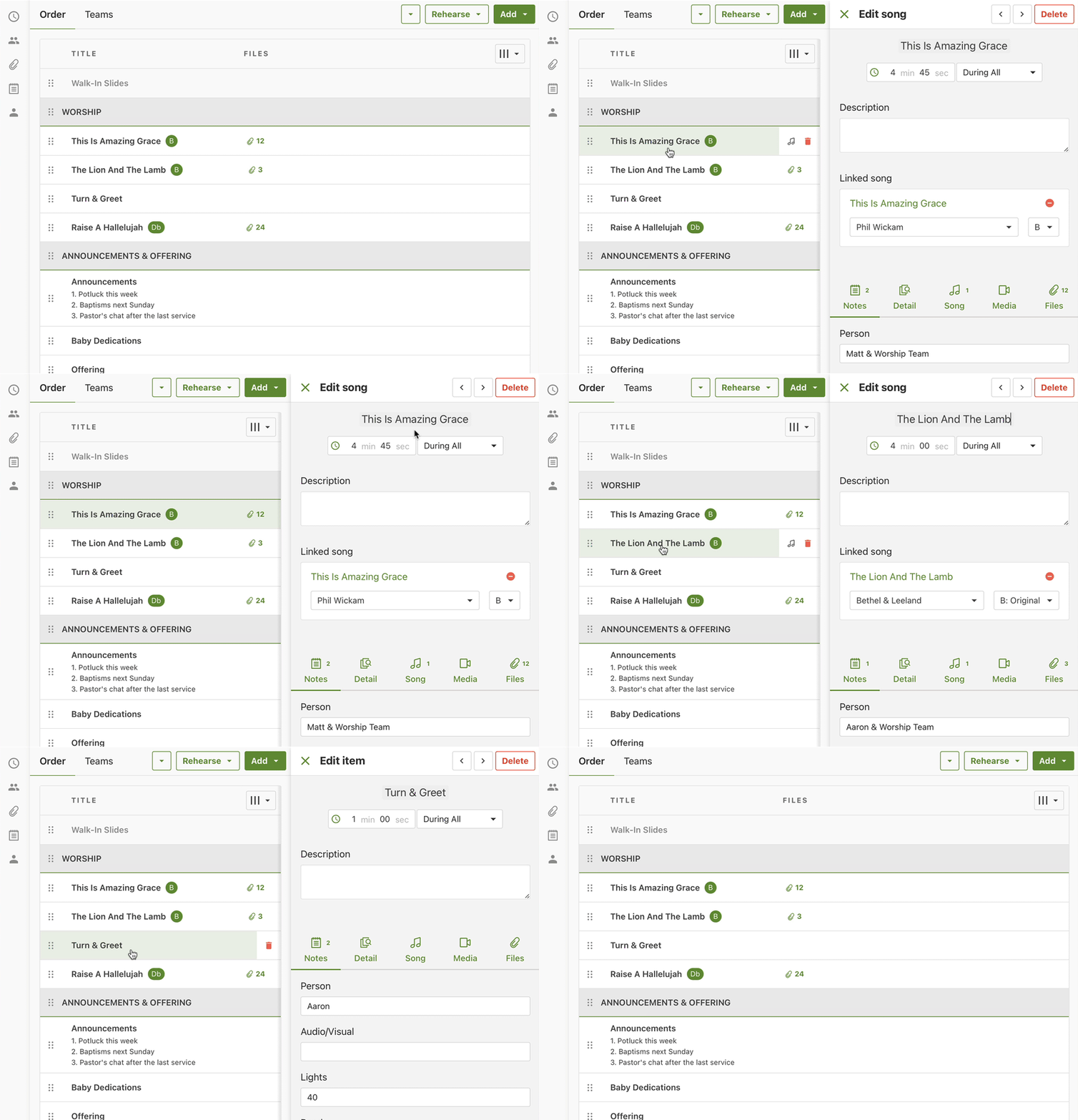
When you look at the order of service, you’ll see the biggest change is that editing an item shows its details in a drawer on the right instead of blocking the whole screen. This lets you click on other items without having to close the one you’re on. How convenient!

There are a few ways to add items, optimized for different types of workflows. A simple click adds it to the end, or now you can drag an item type directly into any spot. When adding songs or media, you can add one by clicking it, or you can click “add multiple” at the top right and choose as many as you want.

When it comes to music prep, you can now add files to a song right on the plan page without needing to visit the song library. When it’s time to listen to audio, the new media player sticks to the bottom of the screen with a popup playlist. You can also navigate to almost any other page without interrupting your listening session.
👨👩👧 Foster Your Roster
Scheduling people to your roster used to be a fragmented experience. Now we’ve consolidated all your team options into an actions menu.
When adding people, the new right-side drawer makes it easy to switch between team members or guests. The team members tab is smartly ordered, grouping people with no conflicts at the top and sorting them by the date they were last scheduled — the same way Auto-Schedule would pick them. You can also click the “add multiple” button to schedule everyone on the team, great for scheduling choirs or other fixed teams.


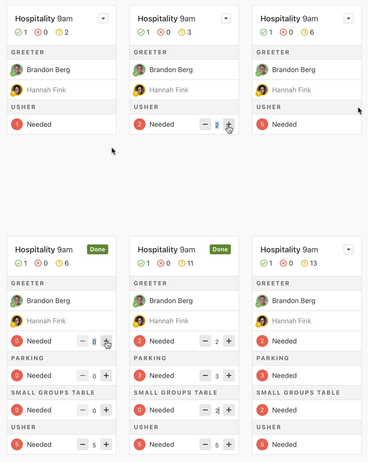
When you aren’t ready to pick a person, but you want to save a spot, you can add needed positions, and it’s easier than ever. The old way covered the whole screen and was one team at a time. The new way lets you add them in place, so you can see everything that’s already added. Plus you can edit them for many teams at once. You could say this feature was...needed. 😉
💚 More to Adore
Look, my creativity for clever headers ran out, so the remaining miscellany is here. There are so many other small refinements, like a new contributors section showing who changed parts of the plan, the ability to hide item length or time columns, expanded shortcut keys like alt/opt-clicking on a person’s face or a song item’s green key circle, or even hovering over an item and adding a new one above it by typing i, s, m, or h.
I’m even more excited that because the new page is expandable, we can add more features without cluttering things up. We’re actually going to start adding exciting new things soon — how does next week sound?
For now, all Administrators, Editors, and Schedulers can use the new page by clicking the “try it now” button at the top of any plan. Viewers and Scheduled Viewers will get access in the next month or two.
At that point, everyone will still be able to switch back and forth between versions for a few more months to get used to it on their own time.
Sound like a plan? 😎
:quality(80))